A life lived ‘By Design’: Current exhibitions provide insight into Charles Burchfield’s life and work
Courtesy of Burchfield Penney Arts Center
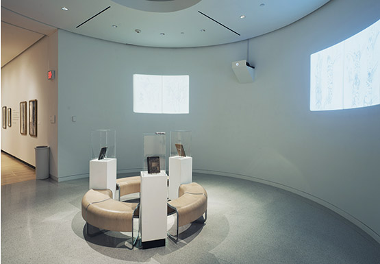
“Evidence of Intent” features pages of artist Charles Burchfield’s journal. It is on display at the Burchfield Penney Art Center.
Current Burchfield Penney Art Center exhibitions By Design and Evidence of Intent give viewers a glimpse into the life of Charles E. Burchfield like never before. The works and the way in which they are assembled document the transition of young Burchfield from designer to artist, with most works being displayed for the first time.
Originally a design student, Burchfield’s work included designing posters for college competitions, many of which are on display at the Burchfield Penney now. A pivotal moment of transition may likely have been on Sept. 6, 1914, when he said to his mother that he wanted to paint scenes.
“Then you’re going to be an artist?” she asked.
He replied, “Yes.”
****
It was after Burchfield’s junior year at the Cleveland School of Art in 1915 that his artistic style had largely developed. Only two years later would he experience what he considered to be his “Golden Year” as an artist. He later went on to be the first artist to ever have a solo exhibition at the Museum of Modern Art in 1930.
Through his college years and beyond, the young Burchfield made sure to document his experiences and thoughts alongside his artistic productions. The fact that he left such an extensive paper trail made the jobs of the exhibitions’ curators and designers a bit easier.
“I don’t think we could have felt confident about interpreting these without the journals,” designer Brian Grunert said.
Both he and Kyle Morrissey were asked to be part of the project because of their design background. The two work in White Bicycle design studio, but this was the first time they had co-curated an exhibition.
Burchfield’s first job as an artist was as assistant designer at M. H. Birge & Sons, a Buffalo wallpaper company. Here, he transformed designs from past paintings to wallpaper with a more mature hand.
He found that he was not content painting such commercialized images for long. His idea of art was different than what he was producing. So, in 1929, he left M.H. Birge & Sons to paint full time.
The exhibition works are interesting in their own right, but with much of them around a century old, the task was to make their display more fresh and exciting.
Tullis Johnson, curator for the Burchfield Penney Art Center, had to look for ways to sustain viewer attention long enough for them to get the message.
“It’s well known that a lot of times when people go to museums, they spend no more than three-and-a-half seconds in front of a painting and they don’t get much meaning out of it,” Johnson said. “We’re trying to do things that are a little more interesting and engaging.”
****
The art is displayed in a space that gives off a mid-century modern vibe. The clean quietness stands in sharp contrast to some 1915 works, which is what Johnson hopes will get people to take a second look.
Evidence of Intent is a projection of journal pages from 1912 to 1917 entries. The sketches spread over the concave walls of the rotunda, and continuously cycle through different pages. Burchfield’s journals are encased in the middle of the space, making one feel as if they are actually flipping though the pages.
Grunert said that the most important part of working on the exhibition was being able to say something new about Burchfield’s career, through a different lens. One of the ways in which the curating team changed the focus was by blowing up one of his sketches to the size of a wall.
With the help of muralist Thomas Holt, the first thing visitors see as they walk into in the space is a larger-than-life Burchfield sketch.
This is Holt’s third exhibition drawing at the Burchfield Penney, but the challenge was new. He and the rest of the team had to figure out how to recreate the sketch, and in a way that would look natural.
“There was a very serendipitous moment where this came about,” Holt said.
They found that if they used a very large oil pastel, the way that it leaves marks on the wall is very similar to how conte crayon writes on paper.
After confronting the giant mural and continuing through the space, visitors get a treat. Rather than the classic scene-setting Burchfield, they meet a younger, design oriented one.
“I enjoy the first room a lot because it’s so different from what people are used to seeing,” Johnson said. “They’re used to seeing landscapes.”
Fusing the roles of designer and artist, Burchfield conventionalized his art. He incorporated design elements in his nature works, like making sure there was a pattern to the way thorns were placed on stems. He focused intensely, and never gave up one role for the other.
“The overwhelming sense is, this guy worked really hard,” Grunert said.
****
It is no secret that Burchfield loved natural environments. But after going through the archives, Johnson was struck by how often natural commentary popped up.
“He was an environmentalist before the term existed,” he said.
He complained about the insecticides being used on Route 219 to kill plants and weeds. Johnson said that he even wrote about riding his bike all the way from Cleveland to Salem.
“I think that there’s so many different stories,” Johnson said. “Burchfield would always rather be outside walking in the woods.”
There is one Christmas poster in particular that helps demonstrate Burchfield’s experimentation and progression as both a designer and artist. Both designers agree that the poster was not very well designed, but Johnson thinks it is a necessary piece of the puzzle.
“I think to show work like that makes the story more dynamic,” Johnson said.
College students can take a lot from this exhibition, since many of the works are from Burchfield’s own college years. According to Grunert, writers can get a lot out of his writing approach, and art and design students can see that the core elements of design are what hold true, and that problems must be worked out, not stepped around.
Burchfield’s advice?
“An artist must paint not what he sees in nature, but what is there,” said Burchfield. “To do so he must invent symbols, which, if properly used, make his work seem even more real than what is in front of him.”
Email: wulff.record@live.com
Twitter: @WulffSamantha


